Ledge Journal

One of our menu bars got out of hand sometime in 2024. Twelve icons, half of them hidden behind the notch, no way to remember which was which. The moment that broke it: clicking what looked like the VPN icon and turning off Bluetooth in the middle of a call. That's when we started thinking about the notch as a place for the widgets you only glance at, and the menu bar as a place for the state you actually need to see.
That's the short answer. Menu-bar icons stay visible all the time in a strip across the top. Notch widgets stay hidden in a panel that unrolls when you push the cursor into it. Both work. Which one wins depends on whether the info needs to be always visible or only on demand, and how crammed your top strip already is.
What each one actually is
A menu-bar app is a small icon (and optional dropdown) that lives permanently in the top strip next to the clock. It's drawn even when you don't care. macOS ships with a few (battery, Wi-Fi, sound, Spotlight) and third-party apps add more.
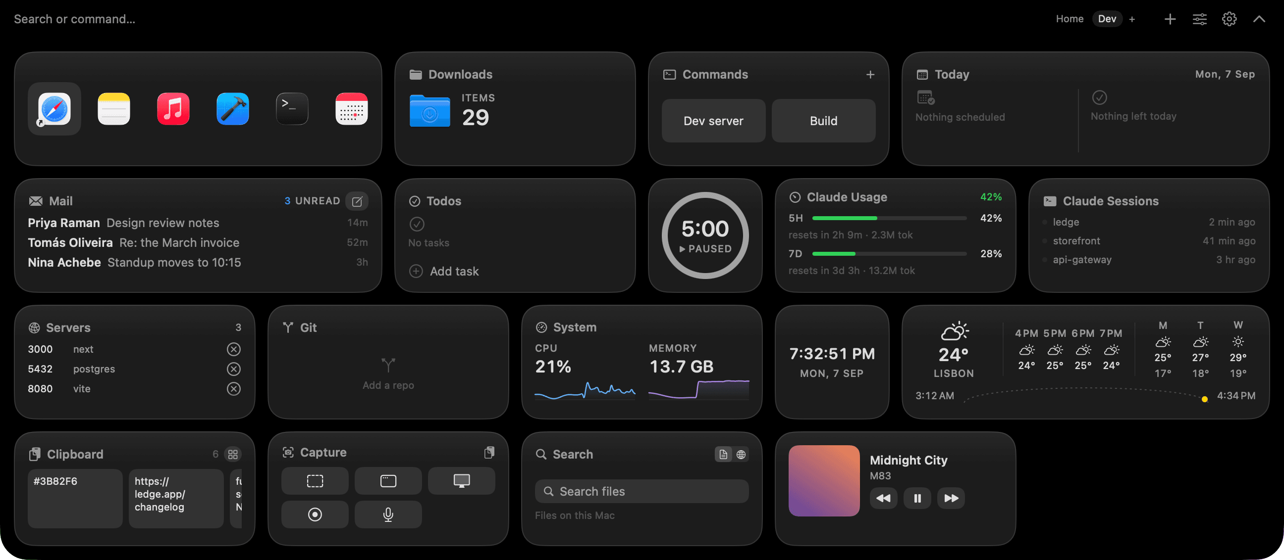
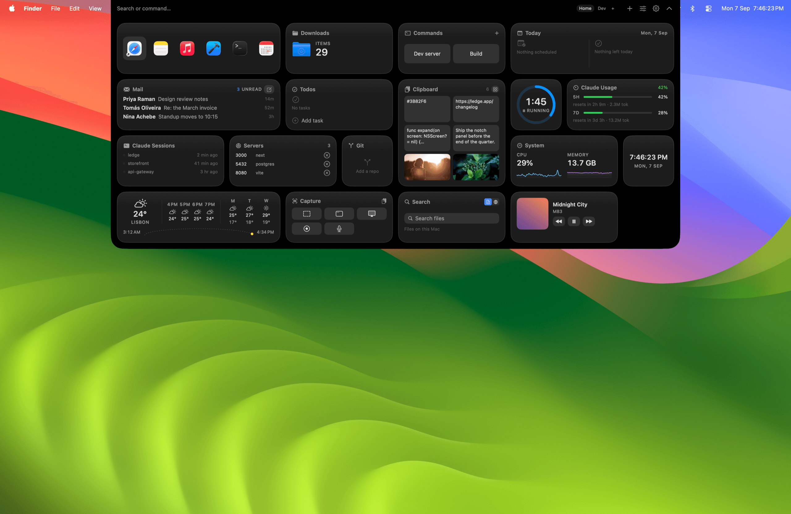
A notch app is a widget panel anchored to the display notch. It stays collapsed by default and unrolls into a larger panel when you hover the notch or press a shortcut. When the cursor leaves, it collapses again. On a MacBook without a notch, the panel usually drops from the top edge of the display instead.
 Collapsed capsule between opens. This is what "hidden until you look" looks like.
Notch panel wins when the info is glanceable, not persistent
Anything you check occasionally rather than continuously is a better fit for the notch.
Calendar peeks, weather, timer status, clipboard history, Now Playing. Each of these answers a one-question glance. You don't need them on screen at all times. Putting them in a panel that stays hidden until you ask keeps the top of the screen calm and gives each widget more room when it does open. The alternative is six menu-bar icons stealing a strip of screen for info you look at twice an hour.
Menu bar wins when the info must stay visible
A menu-bar icon is the right home for a number or state you monitor continuously.
Battery percentage, VPN status, current network, whether recording is on, which Focus mode is active. Their whole job is to tell you if something changed. A notch panel that hides itself defeats that purpose. Menu-bar tools like iStat Menus are built for exactly this shape of information, and they're good at it.
When the menu bar is too full, the notch helps
The notch already eats horizontal menu-bar space. On a 13-inch MacBook it takes about six or seven app icons before macOS starts hiding items behind the camera bump.
Bartender is the incumbent fix. It groups and hides menu-bar icons so only the ones you want stay visible. A notch app is a different fix: move the widgets that don't need to be always-visible out of the menu bar entirely, into a panel that stays collapsed. The two are complementary. Bartender tidies what remains. The notch app removes some of what would have been there.
We use both. Bartender for the icons we keep (mostly system state), Ledge for everything else.
Where Raycast fits in
Raycast is a keyboard-first launcher that also runs in the menu bar and can display small live indicators. It's a different shape of tool: you open it with a shortcut, type what you want, act.
The honest split: Raycast is optimized for typing. A notch panel is optimized for looking. If you already live in Raycast's command bar, use it for calculations, launches, and clipboard. Use the notch for the visual widgets (calendar grid, weather forecast, media artwork, timer countdown) that benefit from a rendered layout rather than a text prompt.
A rough decision table
The same widget can go in different places for different people. Someone monitoring CPU on a build machine wants it in the menu bar; someone who checks it a few times a day wants it in the notch. This is the rough split we'd start from.
| Widget or info | Best surface | Why |
|---|---|---|
| Battery percentage | Menu bar | Must stay visible |
| Wi-Fi / VPN status | Menu bar | Must stay visible |
| Focus mode | Menu bar | Must stay visible |
| Recording indicator | Menu bar | Must stay visible |
| Calendar peek | Notch | Glanced, not monitored |
| Weather forecast | Notch | Needs layout room |
| Now Playing with controls | Notch | Bigger buttons, artwork |
| Clipboard history | Notch or launcher | Both work, pick one |
| Timer / Pomodoro | Notch | Glanced when you check |
| App launcher | Launcher (Raycast/Alfred) | Typed, not seen |
| System stats (CPU, memory) | Either | Notch if occasional, menu bar if constant |
| Git status for current repo | Notch | Glanced, not monitored |
When to skip a notch app entirely
Not everyone needs one. A few cases where we'd tell you not to bother.
- Your Mac has no notch. MacBooks before the 2021 Pro and 2022 Air. Notch apps still work by dropping a panel from the top edge, but the "hover the notch" gesture isn't there. Menu-bar apps are the natural fit.
- You use two menu-bar apps total. If the top of your screen is already clean, a notch panel is solving a problem you don't have.
- You prefer typing to hovering. Raycast plus a clipboard manager plus a calendar app already covers a lot of the same ground.
When to skip menu-bar clutter and move to the notch
The other direction is easier to spot.
- macOS is hiding menu-bar icons behind the notch. That's the signal. Move the widgets you glance at (not the ones you monitor) into a notch panel.
- You keep opening the same three apps to check the same three things. Calendar for the next meeting, Weather for the forecast, Music for the current track. A notch panel puts them on one glance.
- You want a clean menu bar without paying for Bartender. A notch app removes widgets from the menu bar entirely rather than hiding them, which is a different way to solve the same crowding problem.
Where Ledge fits
Ledge is a notch widget panel that puts calendar, weather, Now Playing, clipboard, timer, git status, and more onto switchable pages for different contexts. It coexists with Bartender or Raycast: Bartender tidies the menu bar, Raycast handles keyboard-driven launching, Ledge covers the glanceable widgets. Three tools, one Mac, none of them doing the others' job.
If you want the free path first, Boring Notch is open source and Notchy is free with donations. Prices and features change; check each site before you buy.
FAQ
Do I need both a notch app and a menu-bar cleaner? No. If you move enough widgets into the notch, the menu bar gets clean on its own. Bartender helps when you still have many menu-bar apps you want to keep.
Will a notch app replace Raycast? For most people, no. Raycast is a typed command bar; a notch panel is a visual widget surface. They overlap on clipboard and some launcher features but don't compete head-to-head.
Does macOS's own menu bar support widgets? macOS Sonoma added desktop widgets that also appear over apps in a translucent style, but those live on the desktop, not the menu bar. The menu bar is still just icons and dropdowns.
Do notch apps work on external displays? They render on the MacBook display where the notch lives. External displays keep their own menu bar and are not affected.
Can I put system stats in the notch instead of the menu bar? Yes, though if you monitor CPU or memory continuously the menu bar's always-visible strip is the better home. Save the notch for the stats you glance at, not the ones you watch.